Branding
How Apollo Download Manager looks: the mark, the app icon, the colours and the type. The product name is decided in ADR-0018. The source artwork is in assets/brand/.
The identity comes from #347. These are the PO's decisions there, all on 2026-11-05:
The mark is a letter A that shows speed.
The colours match the app's current theme.
The A is split along its leg (the "P2" design).
The app icon is the A alone, without a tile.
The A is coloured in two flat tones.
The name in text
Always "Apollo Download Manager", never "Apollo" alone. This is the PO's rule on #347, to avoid trademark issues, since many products are called "Apollo" (ADR-0018).
The short form is "Apollo DM", for places with little room, such as the browser extension's short name or a badge.
The full logo still shows the full name: the mark stands in for the A of "Apollo", and "DOWNLOAD MANAGER" is always part of it.
The mark
A capital A, leaning 10° forward, with a thin streak cut from its left leg. The streak runs parallel to the leg, like a motion line inside the letter.
It is built on a 128-unit grid:
Cap height: 12 units.
Baseline: 112 units.
Crossbar band: from 72 to 92 units.
Streak width: 4 units in the full mark and 7 in the small one.
Stroke weight: the same throughout.
The mark has three kinds of drawing, because a thin streak can't survive being scaled down:
| Drawing | Use | Difference |
|---|---|---|
Full (apollo-icon.svg) | 64 px and larger, and the lockups | The proportions above |
Small (apollo-icon-small.svg) | Inside the app (the sidebar logo and icon) | Thicker legs, a smaller counter and a wider streak (7 units) |
Pixel grid (apollo-icon-16.svg to apollo-icon-48.svg) | The desktop icon at exactly 16, 20, 24, 32, 40 and 48 px | The small drawing redrawn for each size with every corner on a whole pixel, so the cap, crossbar and feet are crisp lines. 16 and 20 px: one tone (#2373D9), no streak. 24 px: two tones, no streak. 32 px and up: the streak too |
The small sizes use slightly lighter blues than the full icon: #1B68CB behind and #2F80E4 in front, or #2373D9 alone at 16 and 20 px. Each passes 3:1 on both a light (#EEF1F5) and a dark (#202020) taskbar, computed with the WCAG formula: #1B68CB 4.8 and 3.0, #2F80E4 3.5 and 4.1, #2373D9 4.1 and 3.5.
The app icon
The A alone, with no tile or border, as many app icons in the Windows Start menu are. The surrounding desktop, taskbar or browser shows through.
Two flat tones, with no gradient or shine:
| Part | Colour |
|---|---|
| The back half (the left leg and the streak) | #1659B3 |
| The front half (the right leg) | #2F80E4 |
Microsoft's guideline is that at least half of an icon has 3:1 contrast on both light and dark backgrounds. Here, both halves pass on light backgrounds, and the front half carries the contrast on dark ones. The figures are computed with the WCAG formula, not measured on screen:
| Half | Light background | Dark taskbar (#202020) |
|---|---|---|
Back (#1659B3) | 6.7:1 on white | 2.4:1 |
Front (#2F80E4) | 3.9:1 on white | 4.1:1 |
The source rules are in the Windows app icon guidelines, the GNOME app icon guidelines and the Chrome Web Store image guidelines:
one idea, with no text in the icon;
simple shapes with one stroke weight;
no outer shadow or border, because the desktop adds its own;
a separate drawing for small sizes.
Colours
The identity uses the app's existing theme tokens in src/index.css, so the window and the icon match.
| Role | Light | Dark |
|---|---|---|
| Accent (buttons, links, the mark in one colour) | #1B68CB | #5092F0 |
| Ink (text, the mark on light) | #0F172A | #E6EBF2 |
| Icon, back half | #1659B3 | #2F80E4 in the dark lockup |
| Icon, front half | #2F80E4 | #5092F0 in the dark lockup |
On dark backgrounds the lockup moves both halves one step lighter (apollo-lockup-dark.svg), so the mark keeps its weight.
The window's layout
The window's layout (PO requests on #347):
The frame: the title bar, the status bar and the gaps share one colour,
--frame(#D9DFE7light,#07090Ddark), so they read as the window's background.Floating panels: the sidebar, the download list, the details panel and the other views each sit on the frame as their own rounded panel, 4 px apart (
src/layout/panel.ts). The resize handles are the gaps between them: a thin blue line shows in the gap after a short pause on hover, and at once while dragging.The sidebar is white, like the main page (
--sidebarmatches--surface). The selected item has a light grey fill and the hover a light blue one.The title bar is the app's own (
src/app/TitleBar.tsx): the system's is turned off ("decorations": false). It shows the icon and the name, drags the window, maximises it on a double-click, and has its own minimise, maximise and close buttons. Close goes through the same close handling as before, so it still hides to the tray when the settings say so.Known limit: on Windows 11, resting the mouse on the maximise button doesn't show the system's box of snap layouts, because the button is the app's own. Dragging the window to a screen edge, Win+Z and Win+arrow keys still snap it (PO: leave it for now; #359).
The full logo
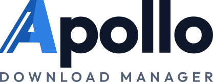
The mark stands in for the A of "Apollo", followed by "pollo", with "DOWNLOAD MANAGER" spaced out underneath (PO decision on #347, design "L4"). The files are apollo-lockup-light.svg and apollo-lockup-dark.svg.
It is an aligned block, "equal all round in a perfect rectangle" (PO decision on #347):
Equal width: "DOWNLOAD MANAGER" is spaced to end exactly where "pollo" ends, so both edges line up.
Equal margins: the file's edges sit the same distance outside the block on all four sides, 40 units, about a quarter of the logo's height. Keep at least this much clear space around it.
In the window, the sidebar shows the logo 112 px wide, with the button that collapses the sidebar beside it, and the first-run screen shows it above the welcome heading (src/components/BrandLogo.tsx). The narrow sidebar shows the icon alone. Inside the app the logo's A is the small drawing, so its streak stays visible at that size.
Type
The wordmark is set in Outfit, a geometric sans-serif from Google Fonts:
"pollo": weight 700, tracking −3 at 142 units. Its cap height matches the mark.
"DOWNLOAD MANAGER": weight 600, letter-spaced 9, in the muted text colour.
Licence: Outfit is under the SIL Open Font License (by Smartsheet Inc and Rodrigo Fuenzalida; the
METADATA.pbfile in Google's fonts repository,ofl/outfit).The font isn't shipped. The wordmark is converted to outlines, from the static Outfit Bold and SemiBold files in the font's official repository (
Outfitio/Outfit-Fonts, OFL-1.1). The logo files and the app hold only the shapes, so the font is neither in the app nor a dependency, and the logo looks the same everywhere. The two lines are spaced so their ink runs exactly from the logo's left edge to its right edge.
The window stays in Inter (
--font-sans).
Using the mark
Clear space: keep at least the width of the streak's leg (about a quarter of the mark's height) empty around the mark.
On a photo or colour: use the one-colour mark (
apollo-mark.svg) in ink or white.Don't:
put the icon back on a tile;
add shadows, outlines or gradients;
change the lean;
recolour one half only;
stretch the mark;
set the wordmark in another font;
put an ordinary letter A in front of the mark: the mark is the A.
Generating the icons
The desktop icons in src-tauri/icons/ are generated from the SVG sources, never edited by hand. The steps are in assets/brand/README.md.
The repository
Name:
Singlbase-Technologies-Limited/apollo-download-manager(PO decision on #347); it wasvelocity_download_manager_v2, and GitHub redirects the old address.Social preview:
assets/brand/apollo-social-preview.png, 1280 × 640, the light full logo on the app's light background. How to render it is inassets/brand/README.md.
Still to do
The browser extension's icons. They come with the extension redesign (#356), from the pixel-grid drawings.